Upon landing in your online shop, your photos are the first thing that speaks to your customers about your work. If the photos are out of focus, pixelated, confusing, or poorly lit, you've lost a potential customer. If you don't take the time to share excellent photos of your items, don't wonder why you aren't making any sales. It is the most important thing about online selling; good photos of your work pay off.
Fortunately, you don't need to be a professional photographer to take decent photos of your items.If you are using your phone to take photos, it is a good idea to research online camera guides or tutorials that match your phone type and camera program. For example, many smart phones offer 'professional' settings to give you some control over lighting settings or white balance... Some do not. A little research can go a long way in presenting your items as they deserve.
Get a tripod.
Whether you are shooting with a camera or smartphone, an inexpensive small table top tripod will ensure a steady shot.
Natural lighting won't let you down...
...but using the flash always will. Flash photography will change the colors of your items, create glare, or otherwise misrepresent your craft, period. Using the flash also creates unwanted darker shadows. So, set up your display near a window, or if you go outside, take your photos in the morning or afternoon when the sun is not directly overhead.
Open your camera's manual and learn about the white balance setting.
It's easier than you think, will only take a second, and you will be glad you did when your pictures are brighter and cleaner. If you use plain white for your background, make sure it is truly WHITE by white balancing your camera. I often see grey-white, underlit backgrounds and it looks terrible. (Another great solution to giving your stuff great lighting: try googling "creating your own at-home lightbox" for photographing small items. It's easy and cheap to make your own mini photography studio!)
Place your items on non-distracting and complimentary backgrounds.
You don't want to use colors or textures too similar to your item that will cause it to blend in. Contrasting elements will make your item stand out, but choose wisely and make sure the placement of your artwork "makes sense". Being consistent with your backgrounds will help brand your shop. Time after time I see people's household items in the background and it looks completely unprofessional and draws the eye away from the item being photographed.
Take photos at various angles.
You will want to include a close up (using your macro setting on your camera will help you achieve clear close ups) when you list an item to sell. Take advantage of uploading as many pictures as allowed per item! Let your buyer see your item completely so they know what they're getting. I see so many people just uploading one photo of their item. Those people shouldn't wonder why they aren't making any sales either.
Bonus Tip For Framed Art Pieces.
You will want to check out this blog post: 5 Online Tips to Show Your Art in a Room
Good photos = more online sales. Bad photos won't get you anywhere.
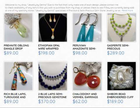
Pictured Above: Jewelry by Gerina Shop
I like many of these shop photos, they are clean, sharp, naturally lit, and non distracting. She uses shells and pennies to give the shopper context, a great idea!
Take some time to look around the marketplace to get ideas for your photos! (Or to see what not to do. 😎)


